Booking-focused homepage
A homepage sequenced from portfolio to packages to quote request, built to move a visitor steadily toward an inquiry instead of a passive scroll through photos.
A catering kitchen website design earns its keep by turning event photography into booked inquiries, not by looking impressive in isolation. Someone planning a wedding, corporate event or production shoot is comparing several caterers in one sitting, so the site has to show real work fast and make requesting a quote feel like the obvious next step rather than a chore.
What it costs
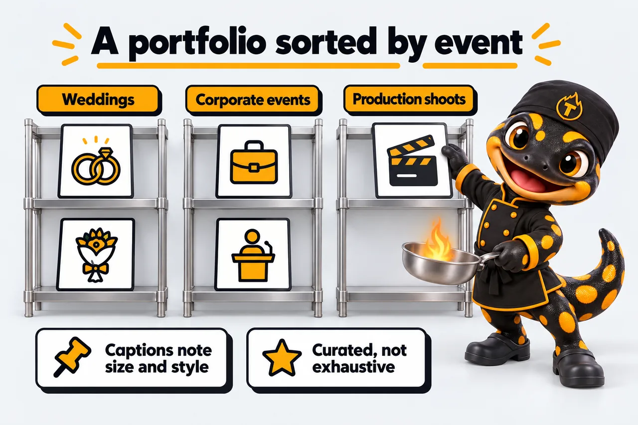
Event planners and corporate buyers scroll fast and compare caterers side by side in open browser tabs, so the portfolio section carries more weight than almost anything else on the page. It needs real photography from actual events, organized by event type or package rather than dumped into one long gallery, so a wedding planner is not wading through corporate boxed lunches to find comparable work. Captions that note the event size or style help a visitor picture their own event in that same setting. A portfolio that looks curated rather than exhaustive tends to convert better, because it signals a caterer who is selective about quality rather than one taking every job that comes in.
Catering buyers are often quoting several vendors and want a rough sense of fit before they commit time to a call. Presenting packages or starting price ranges by event type, alongside a short note on customization, lowers the friction to reach out because the visitor already knows they are in the right range. A quote request form should ask for the details that actually shape a proposal, guest count, date, event type, dietary needs, so the first response back can be specific rather than a generic follow-up email. Photography and packages work together here: the photos build desire, the packages and form turn that desire into a submitted inquiry.
The visual language for a catering kitchen should feel closer to an event or hospitality brand than a restaurant menu page: generous photography, one confident accent color used on booking calls to action, and typography that reads well in both a quick mobile scroll and a slower desktop comparison session. Testimonials from planners or repeat corporate clients belong near the quote form, not buried on a separate page, because that is the exact moment a visitor is deciding whether to commit. A clean, uncluttered layout also signals the kind of operational polish a buyer is hoping shows up on the day of their event.
A catering kitchen serving several cities or event regions needs the design to hold multiple service areas without turning the homepage into a list of towns nobody reads carefully. That usually means dedicated location or coverage pages linked from a simple area selector, each with its own contact routing and relevant portfolio pieces pulled from events actually held nearby. If that structure is where the business is heading, it is worth planning the page architecture for it from the first design pass rather than retrofitting it once inquiries start arriving from cities the current site never addressed. The multi-location catering page covers how that gets built out in detail.
A homepage sequenced from portfolio to packages to quote request, built to move a visitor steadily toward an inquiry instead of a passive scroll through photos.
A photography grid organized by event style so a planner can find comparable work in a few seconds instead of scrolling past events that do not match.
A packages section presenting starting ranges by event type, built so a buyer can self-qualify on fit before ever contacting you directly for a full quote.
A form capturing guest count, date, event type and dietary needs so your first response back can be specific rather than a generic follow-up email.
Planner and client quotes placed beside the quote form, positioned at the exact point a visitor is deciding whether to commit to reaching out.
A full review of the portfolio, packages and quote form before launch, checked on both mobile and desktop so nothing breaks a booking mid-scroll.
What changed for these kitchen teams, in their own operational terms.
Order noteNo. 201
“They built the FAQ from our actual commissary kitchen tours correspondence. Each answer was reviewed by our own staff, so the page sounds like us rather than a copywriter. New starters read it too; it has become our reference, not just the customers'.”
Alison Rushworth, Office coordinator
Dark kitchen and prep space rental, Plano, TX
FAQ research and editorial review for commissary kitchen tours
Order noteNo. 202
“Converting our commissary kitchen tours attachment into proper pages was overdue. The content is the same material, reorganized into headed sections that work on any screen. Nothing was taken away from the people who like paper.”
Huda Shalhoub, Intake coordinator
Farm shop production kitchen hire, Manchester, NH
Structured reference pages for commissary kitchen tours
Two comparisons that cover the alternatives most operators look at before commissioning this work. Both name the cases where the other option is the better fit.
Yes, that is the recommended structure. Grouping by wedding, corporate, production or private event lets a visitor find comparable work quickly instead of scrolling past events that do not match what they are planning, which keeps them engaged and reading longer before they leave.
Yes, the form fields are set to whatever information actually shapes your proposals, such as guest count, venue, date and dietary restrictions, so the inquiries that land in your inbox are ready to quote from without a round of clarifying emails first.
Yes, most catering sites work best with starting ranges by event type rather than a full price list, which keeps the buyer moving toward a quote request instead of self-selecting out over a single number they saw before understanding the full package.
The design can hold multiple service areas through dedicated location pages linked from a simple selector, each routing inquiries correctly to the right team; the multi-location catering page covers that structure in more detail and how it scales as you add cities.
Launch runs 7 to 15 working days depending on the plan, with 5 revisions a month included afterward and any additional round beyond those billed at $20, so updates stay predictable well after the site first goes live.
A live walk-through of the site you would get, in about 30 minutes. Plans from $117 a month, the $647 build fee invoiced only after launch, domain and hosting included.
Book a demoOr email and a person replies within one working day.
Everything on the pass
Book a demoSearch this site
Type to search every page and article. Press Enter for the full results page.
Appearance
Colour scheme
Accent
5 accents, all drawn from the same kitchen. Saved on this device only.
KitchenWebStudio uses the cookies below. Necessary cookies keep the site working and cannot be turned off.
Saved on this device only. Press Esc to close.