Facility-first homepage
A homepage built around station availability and licensing readiness instead of restaurant-style menu content, written for a tenant comparing facilities, not a hungry diner.
A commissary kitchen website design has to convince a prospective tenant that this facility has the station, the licensing paperwork and the schedule they need, all before they ever pick up the phone. That is a different buyer than a ghost kitchen customer ordering dinner, so the homepage is built around availability, equipment and terms rather than menus or food photography.
What it costs
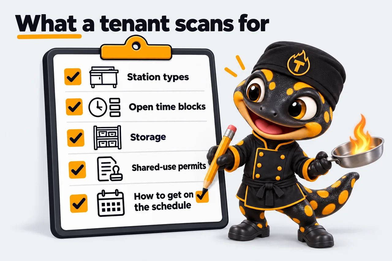
Someone landing on a commissary kitchen site is usually a food truck operator, a caterer or a virtual brand founder trying to find kitchen capacity fast, often against a lease deadline of their own. They are scanning for station types, available time blocks, storage and whether the facility already carries the shared-use permits they need to bring their business documentation to. A page that opens with a lifestyle photo of a chef plating food misses that buyer entirely. The homepage instead needs to read almost like a facility spec sheet with a human tone: what kind of stations exist, roughly how many are open, and what a tenant does next to get on the schedule.
A commissary site converts on trust and specificity, not visual flair. That means real photos of the actual stations and equipment rather than stock kitchen imagery, a clear breakdown of what is included at each station tier, and a facility layout or floor plan that shows how much space and access a tenant is renting. An inquiry form that asks the right qualifying questions up front, business type, station needs, target start date, saves both sides a wasted call. Tenant photos or short quotes from current renters do more to build confidence here than almost any design flourish, because the buyer is trying to picture their own team operating in that space every day.
A commissary kitchen is a B2B facility, and the design language should read that way: restrained color, clean type, and a layout that favors clarity over decoration. Overly playful branding tends to undercut the seriousness a tenant is looking for when they are about to sign a licensing agreement and move equipment in. That does not mean cold or generic; it means the personality shows up in the photography and the writing rather than in busy graphics or decorative flourishes that add nothing. One accent color, used consistently on the inquiry button and section dividers, keeps the whole page feeling like it belongs to a single, dependable operation a tenant can trust with their business.
Many commissary operators eventually open a second facility or already run more than one, and the site design needs a structure that can hold that without turning into a maze of unrelated pages. Each location needs its own page with its own stations, hours and inquiry routing, tied together under one shared brand identity so a visitor always knows which facility they are looking at. If that is where the facility is headed, the layout and content model should be planned for it from the first build rather than bolted on later. The shared kitchen space page walks through what that multi-location structure looks like in practice.
A homepage built around station availability and licensing readiness instead of restaurant-style menu content, written for a tenant comparing facilities, not a hungry diner.
A page section showing station tiers, equipment included and a layout view of the facility, so a prospective tenant can picture their own team working there.
A form built to capture business type, station needs and start date so every lead that reaches your inbox is already pre-qualified and ready to schedule.
A gallery structured to hold actual station and equipment photos rather than generic commercial kitchen stock, sized so it loads quickly on any device.
A block for quotes or photos from current renters, placed where a prospective tenant is deciding whether to inquire, building trust at the exact right moment.
A full check of every inquiry form, station listing and image before launch, tested on desktop and mobile so nothing looks unfinished to a first-time visitor.
What changed for these kitchen teams, in their own operational terms.
Order noteNo. 201
“My first check was simple: open the commissary kitchen tours page on a phone and try to get in touch. The important details sit near the top and the inquiry button is impossible to miss. Staff can now text a single link mid-call instead of narrating the menu.”
Nicholas Nightingale, Front desk coordinator
Meal prep production kitchen, Salem, OR
Mobile navigation and page layout for commissary kitchen tours
Order noteNo. 202
“The question 'who is answering this one?' used to hang over every commissary kitchen tours inquiry. Requests are assigned automatically, with a backup for when the owner is away. The website and our way of working finally match.”
Vasanth Wadhwa, Viewings administrator
Chocolate and patisserie kitchen hire, Akron, OH
Inquiry assignment and staff handover for commissary kitchen tours
Two comparisons that cover the alternatives most operators look at before commissioning this work. Both name the cases where the other option is the better fit.
Yes, the layout is built to hold as many station tiers as the facility offers, each with its own included equipment, access hours and terms, so a tenant can compare options directly on the page before they ever pick up the phone to inquire.
Yes, we build the form around whatever questions actually help you screen a lead, such as business type, insurance status and target start date, so every inquiry that lands in your inbox is already ready to act on rather than a vague first contact.
That is the recommended approach. We size and place your actual facility photography so it loads quickly and reads as credible, rather than filling the page with generic commercial kitchen stock that any tenant has already seen on a dozen other sites.
Each facility gets its own page with its own stations, hours and inquiry routing under one shared brand, structured from the start so adding a new location later does not require rebuilding the entire site from scratch, just adding a page.
Launch runs 7 to 15 working days depending on the plan, and once live the site includes 5 revisions a month with additional rounds beyond those billed at $20 each, so ongoing updates to stations or terms stay affordable and predictable.
A live walk-through of the site you would get, in about 30 minutes. Plans from $117 a month, the $647 build fee invoiced only after launch, domain and hosting included.
Book a demoOr email and a person replies within one working day.
Everything on the pass
Book a demoSearch this site
Type to search every page and article. Press Enter for the full results page.
Appearance
Colour scheme
Accent
5 accents, all drawn from the same kitchen. Saved on this device only.
KitchenWebStudio uses the cookies below. Necessary cookies keep the site working and cannot be turned off.
Saved on this device only. Press Esc to close.